
Decorating Myths That Keep Beginners Stuck

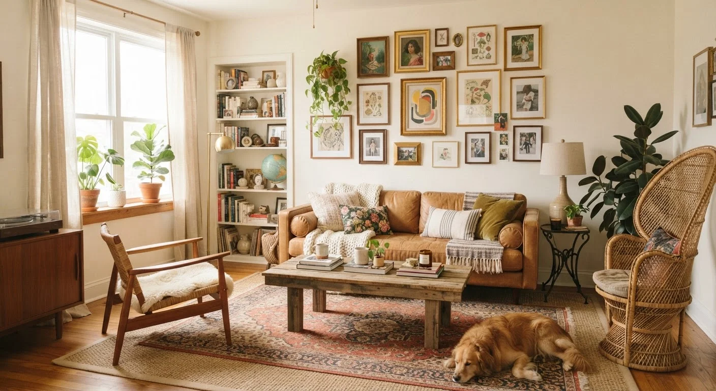
Photo: TotemBuzz.com | Your Lifestyle Companion editorial
Key Takeaways
- Matching everything exactly creates monotony — intentional variety makes a room feel curated and alive.
- White paint does not automatically make a room look bigger; lighting and layout matter far more.
- Decorating on a limited budget is achievable; expensive pieces are not a prerequisite for a stylish home.
- Dark colors can make a room feel cozy and dramatic, not just small and cramped.
- Personal taste is a valid design compass — you do not need to follow trends to achieve a cohesive look.
Why Decorating Myths Persist
Most decorating myths spread the same way: someone repeated a shortcut, a magazine amplified it, and beginners internalized it as gospel. The problem is that these "rules" often oversimplify complex design decisions that depend heavily on context — room size, natural light, how you actually live. When a beginner follows a myth and the result feels off, they usually blame their taste rather than the advice.
This article works through the most stubborn misconceptions and replaces them with practical principles you can actually apply. If you are just starting out, you may also want to review the room-by-room décor starter checklist before making any purchases or layout decisions.
Myth
Everything in a room needs to match — furniture sets, coordinating collections, and uniform finishes are the mark of a well-decorated home.
Fact
Intentional variety creates visual interest. Rooms that rely entirely on matching sets tend to look flat and showroom-like rather than lived-in and personal.
The matching-everything instinct comes from a reasonable place: coordination feels safe. But in practice, rooms that are too matchy lack the tension that makes a space engaging. Interior designers commonly talk about mixing materials, scales, and eras to create depth. A wood side table beside an upholstered sofa beside a metal lamp is not a mistake — it is contrast working in your favor. The goal is cohesion, not uniformity. A shared color palette or a repeating texture (say, linen used in both throw pillows and curtains) is usually enough to tie varied pieces together without making them identical.
Myth
Painting walls white will automatically make any room look bigger and brighter.
Fact
White can work well in some conditions, but it can also look stark, cold, or even gray in rooms with limited natural light. Room perception depends on multiple factors beyond wall color.
The white-equals-bigger assumption is one of the most widespread in decorating. The reality is more nuanced. In a north-facing room with little direct sunlight, a flat or cool-toned white can look washed out and even slightly blue or gray. A warmer off-white — or even a medium-toned color — can paradoxically feel more open because it works with the existing light rather than fighting it. Perception of space is shaped by ceiling height, furniture scale, rug size, and the amount of clutter as much as paint color. Before defaulting to white, sample several shades and assess them under your room's actual lighting conditions at different times of day.
Myth
Dark colors make a room feel small and should be avoided in compact spaces.
Fact
Dark colors can create a sense of depth and coziness. In smaller rooms, they can actually make the space feel more intentional and enveloping rather than cramped.
This myth is understandable — lighter rooms do tend to feel more open in certain configurations. But dark walls, ceilings, or accent pieces are not automatically a problem. A deep navy, forest green, or charcoal can make a small room feel like a deliberate, intimate environment rather than a tight box. The key is contrast and light management: ensure there is adequate lighting, keep large furniture pieces from crowding the perimeter, and use lighter textiles or reflective surfaces to balance the depth. Many professional designers specifically recommend dark colors for rooms that lack architectural character, because they add drama and definition that an all-light palette cannot provide.
Myth
You need to spend a significant amount of money to achieve a stylish home.
Fact
Thoughtful decorating depends far more on proportion, light, and editing than on the price of individual pieces.
Budget is real, but it is rarely the deciding factor in whether a room looks good. Some of the most common décor problems — artwork hung too high, rugs too small, too many small accessories competing for attention — are proportion and placement mistakes, not budget problems. Conversely, expensive furniture arranged poorly in bad lighting will still look off. The most impactful changes in any room tend to be lighting adjustments, decluttering, and getting scale right. That said, it is worth investing selectively in pieces that anchor the room (a sofa, a rug) and being more flexible with accessories that can be updated without major cost.
Myth
Every room needs to follow a specific design style — you must pick one and stick to it.
Fact
Most well-decorated rooms blend influences from multiple styles. What matters is that the combination has an underlying logic, not that it fits a named category.
Design style labels — "mid-century modern," "farmhouse," "Scandi" — are useful shorthand for identifying aesthetics you respond to, but treating them as strict rules is counterproductive. Real homes accumulate meaning over time: a hand-me-down chair, a piece of art bought on a trip, a rug chosen for how it feels underfoot. A cohesive room is one where these pieces are connected by shared proportions, a limited color palette, or complementary materials — not one where every item came from the same style category. If you want a primer on what these style terms actually mean, this plain-language breakdown of design styles is a helpful starting point.
Myth
Decorating is done once a room is furnished — accessories are just the finishing touch.
Fact
Lighting, textiles, and accessories work together with furniture to define how a room actually feels. Treating them as an afterthought typically produces underwhelming results.
Many beginners purchase furniture first and budget nothing for lighting, textiles, or art — then wonder why the room feels incomplete. In practice, layered lighting (overhead, task, and ambient sources) does more to shape a room's atmosphere than almost any other element. Soft furnishings like curtains, throws, and cushions introduce texture and warmth that hard furniture cannot provide. And a clear focal point — whether a piece of art, a statement light fixture, or an architectural feature — gives the eye somewhere to land and makes the room feel resolved. Plan for these elements from the start, not as an afterthought.
Putting the Corrections Into Practice
Understanding that a myth is wrong is only half the work. The other half is knowing what to do instead. A few principles that hold up across nearly every decorating situation:
- Test paint colors in context. Always sample at least two shades on your actual wall and observe them at different times of day before committing. Lighting changes everything.
- Anchor furniture before adding accessories. Large pieces establish scale. Accessories added before furniture placement often end up looking mismatched once the main furniture is in.
- Layer rather than match. Instead of searching for items that coordinate exactly, look for a shared element — a color, a texture, a material — that threads different pieces together. Our guide on mixing furniture styles without making a room feel chaotic covers this in depth.
Don't Skip the Paint Sample Step
Scale is one of the most underestimated factors in decorating. An undersized rug, for instance, is among the most common — and most fixable — missteps beginners make. See laying a rug the right way for sizing and placement guidance. Similarly, common décor proportions that beginners tend to get wrong addresses why artwork hung too high or lamps placed too low can quietly undermine an otherwise well-styled room.
If you are decorating a rented space, decorating your first apartment without starting over every season offers grounded advice for making a space feel intentional without over-committing. And if you find yourself confused by style terminology — words like "Japandi" or "transitional" — what is a design style breaks it down in plain language.
The content on this site is for informational purposes only and is not a substitute for professional advice. Always consult a qualified professional for guidance specific to your situation.