
Warm Tones vs. Cool Tones: Choosing a Color Direction for Your Home

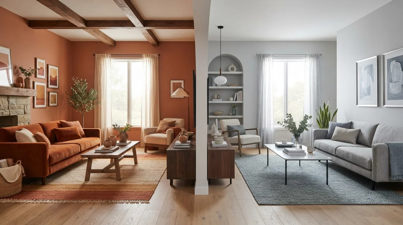
Photo: TotemBuzz.com | Your Lifestyle Companion editorial
Key Takeaways
- Warm tones include reds, oranges, yellows, and earthy neutrals; cool tones include blues, greens, and grey-purples.
- Warm colors make a room feel smaller and cozier; cool colors can make the same space feel larger and more open.
- Natural light direction — north, south, east, or west-facing — significantly affects how any color reads on your walls.
- Neither palette is universally better; the right choice depends on room function, light, and your personal preference.
- Most well-designed rooms blend both palettes, using one as dominant and the other as an accent.
What Makes a Tone Warm or Cool?
Every color sits somewhere on a spectrum between warm and cool, and understanding that spectrum is the first step toward making confident decorating decisions. Warm tones are anchored by red, orange, and yellow — the colors we associate with fire and sunlight. In practical terms, this includes terracotta, rust, mustard, cream, camel, and any neutral with a reddish or yellowish undertone.
Cool tones are anchored by blue, and extend into green and purple. Practically, this means navy, sage, slate, lavender, icy white, and neutrals with a blue or grey undertone. Even beige can land on either side of the divide depending on its undertone — a beige with pink warmth reads very differently from a beige with greenish grey in it.
This matters because paint chips and fabric swatches always look different on a wall than they do in a store. Lighting, adjacent surfaces, and even the time of day shift how a color reads. That's why understanding undertone — not just surface color — is so valuable before you commit.
For a broader view of how color interacts with light and proportion, see our article on visual weight in a room — it explains why color alone rarely tells the whole story.
| Criterion | Warm Tones | Cool Tones |
|---|---|---|
| Core hues | Red, orange, yellow, earthy neutrals | Blue, green, purple, grey neutrals |
| Perceived room size | Makes spaces feel smaller, cozier | Makes spaces feel larger, more open |
| Mood effect | Energizing, sociable, grounding | Calming, focused, refreshing |
| Best natural light pairing | North- or east-facing rooms | South- or west-facing rooms |
| Ideal rooms | Living room, dining room, bedroom | Home office, bathroom, compact spaces |
| Common neutral anchors | Cream, taupe, warm white, camel | Light grey, cool white, slate, linen |
| Risk if overused | Can feel heavy or enclosed | Can feel cold or clinical |
How Each Palette Changes a Room's Feel
Color does more than look pretty — it shapes perception. Warm tones advance, meaning they appear to move toward you, making walls feel closer. In a large, drafty room, this is a feature: it creates intimacy and makes the space feel curated rather than cavernous. In a very small room, it can feel hemming.
Cool tones recede, appearing to push walls back. A bathroom painted in pale blue or soft sage will read as larger than the same room in a deep terracotta. This is especially useful in city apartments and compact rooms where physical square footage is fixed but perception is flexible.
Mood is equally affected. Research in environmental psychology generally supports the idea that warm colors stimulate — they're energizing and social. Cool colors calm — they're associated with rest and focus. Neither is inherently better, but they're suited to different functions. A bedroom might welcome a warm sandy tone to encourage winding down, while a kitchen you use actively in the morning might benefit from a crisp sage or pale aqua to feel refreshing.
~90%
Of initial product judgments attributed to color alone
Research published in the journal Management Decision suggests color accounts for the vast majority of snap aesthetic judgments, underlining its outsized role in how we perceive a space.
2–3°F
Perceived temperature difference between warm and cool rooms
Studies in environmental psychology have found that people in rooms painted with warm colors tend to perceive the temperature as several degrees warmer than those in cool-colored rooms at the same actual temperature.
Lighting amplifies these effects dramatically. A north-facing room already receives cooler, bluer daylight — layering cool paint tones into it can make it feel stark in winter. East-facing rooms get warm morning light and cool afternoon light, so a neutral warm tone can balance both. See our guide on layering light in a room before finalizing any color decision.
Room-by-Room Guidance for Beginners
Rather than picking a palette for your whole home at once, think room by room — each space has a primary purpose that can guide you.
- Living room: Warm tones typically work well here because this is a social space. Terracotta, warm white, soft gold, or camel-toned neutrals make evenings feel cozy. If you want something lighter, a warm off-white still reads as inviting.
- Bedroom: Both palettes can work. Warm blush or dusty rose encourages rest without feeling cold. Cool muted sage or soft lavender leans into calm. Avoid very saturated versions of either — intensity tends to feel restless.
- Home office: Cool tones — particularly greyed blues and soft greens — are generally associated with focus and mental clarity. These are solid starting points for a productive workspace.
- Bathroom: Cool tones reinforce a clean, spa-like feel, but warm stone tones and earthy neutrals can make a bathroom feel luxurious and less clinical.
- Kitchen: Either can work depending on your cabinetry. Cool tones pair naturally with white or grey cabinets; warm tones complement wood, brass, and terracotta tile.
Before jumping to paint, run through a full room checklist — our Room-by-Room Décor Starter Checklist covers scale, lighting, and focal points that all affect how color will land.
Test Before You Commit
Also worth knowing: the paint finish you choose will affect how a color reads. Matte finishes absorb light and make colors feel softer; glossy finishes reflect light and intensify them. Our explainer on paint finishes walks through which finish works where.
Mixing Warm and Cool Without Losing Cohesion
Most appealing interiors don't commit rigidly to one palette — they use one direction as a dominant and the other as an accent. A warm terracotta living room can include a navy blue throw, slate grey bookshelves, or sage green plants without feeling confused, as long as the warm tones carry the dominant visual weight.
The key principle is proportion: roughly 60% dominant tone, 30% secondary tone, 10% accent. This isn't a rule you need to measure, but it's a useful mental model for avoiding a room that feels pulled in too many directions at once.
Neutrals are your bridge. Warm whites, taupes, and natural linens sit closer to the warm side; cool whites, light greys, and charcoals sit closer to the cool side. Choosing the right neutral for your fixed surfaces — floors, trim, cabinetry — before selecting wall color or soft furnishings makes blending far easier.
If you plan to layer multiple furniture styles alongside a mixed palette, see our article on mixing furniture styles — the same proportion-based logic applies to form and era, not just color.
The content on this site is for informational purposes only and is not a substitute for professional advice. Always consult a qualified professional for guidance specific to your situation.